In this first section of a three-part feature on corporate identity and the fleet we will examine the most important factors that businesses need to consider when creating a suitable corporate identity for themselves, which can also translate to the vehicle fleet.
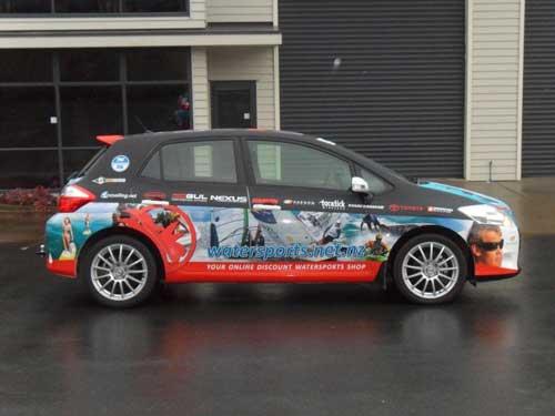
According to Karen and Keith Browne of NZ Sign Solutions, there is no other form of brand advertising or awareness which businesses can opt for which comes close to the competitive cost per impression of wrapping a digital print onto a fleet vehicle.
Where newspaper and television coverage incurs the most cost per impression for a company or business, a moving billboard, such as a digitally wrapped car, van, light or heavy commercial vehicle creates the most impressions at the least expensive cost.
The cost is determined by the design, type of materials used, and whether it is a full or a partial wrap. There are many variables and there are many options available to fleets to maximise their brand exposure within a pre-determined budget.
Vehicle signage is visible to the public for 365 days of the year without the ongoing costs or tensions of advertising deadlines for print, radio or television advertising, and there can also be taxation benefits for wrapping a vehicle.
One important element often overlooked in any vehicle that’s been digitally wrapped is the look of the wheels. Often changing the wheels or by painting them in a complementary colour will further enhance the on-road presence of the vehicle.
But wrapping vehicles is not just a solution for large fleets or well-known brands. Keith Browne says that NZ Sign Solutions is wrapping designs onto smaller vehicle fleets of two to five cars for franchisees, bars, restaurants and beauty spas.
“The size of your fleet doesn’t change the effectiveness,” he says. “It’s cost effective and it works well, regardless of whether the vehicle is moving around or is parked up for the day.”
He says vehicle signage has a huge range of options, from small magnetic signs to full body vehicle wraps, and the wraps are not just limited to cars, trailers, boats, horse floats, racing vehicles and large machinery can also be wrapped. He says the more unique the vehicle, the more attention it is likely to receive.
If the vehicle operates at night or travels long distances, Keith says he would recommend reflective graphics are applied to provide additional visibility. The graphics glow in the dark, making the vehicle look lit-up while moving, which has the added safety advantage of greater visibility to prevent crashes.
Vehicles can also be protected by Stone-Guard – a laminate which is usually applied to the front and bonnet of vehicles to protect from damage caused by stone chips and other road debris.
Sometimes a full vehicle wrap is not necessary. The design could use small adhesive stickers, but it is cost-effective to use a digital wrap in terms of resale value for a vehicle, because it protects the paintwork from damage and it is easily removed thanks to the latest technology used in the manufacture and application of the graphic material.
The flexibility of vehicle wraps allows the fleet to be used to launch a new product, announce an event or promote an advertising campaign, because a short-term digital print can be removed easily and regularly if required, according to Keith Browne of NZ Sign Solutions. Equally he says a full digital wrap can last for more than five years and achieve long-term brand awareness.
It is recommended that fleets should seek out specialists for wrapping their vehicles, because not all general sign shops are able to provide the efficiency and cost competiveness that a specialist offers, particularly with the skill set needed for large and complex graphics when they are being applied to vehicles.
Creating corporate identity
If your organisation does not yet have a corporate identity programme in place, then here are some simple steps to create one.
According to Yahoo! contributor network member Kathy Browning, a corporate identity consists of three elements:
* Company name
* Company logo
* Unique selling position
or tagline
Kathy says that corporate identity is the visual interpretation of the value a company or brand offers to its customers. To achieve this visual interpretation most organisations use a logo. This is a professional graphic that provides a powerful and memorable image of what it stands for.
When designing a company logo she advises the following steps be taken:
• Conduct research. Visit competitor websites and look at their logo designs. Do the logos connect with their company, product or service. Are the colours pleasing to the eye? Do they have a unique selling position or slogan?
• Determine the use of your logo. Will it be used to identify your company, service or product?
• Determine the look of your logo. Will it be the company name, an icon or a graphic? Perhaps it may include both elements. Kathy says that marketing experts are of the opinion that stand alone icon graphics should be avoided until the business is well established. When starting out she says its best to use a graphic and the company name, and ensure the name is clearly visible within the logo.
* Avoid clipart. Kathy says it looks unprofessional and that if companies don’t have internal design resources they are best to hire a professional to design their new logo.
• Design in black and white. Browning says using black and white helps to focus on the typeface, shape and design of the logo. Also it will show if the logo is clear and legible if it is photocopied or faxed.
• Choose two colours. Browning says this is the most cost effective way to print a logo, particularly if companies are planning to advertise in print media.
* Choose the typeface. Browning recommends that not more than two typefaces or fonts are used in the logo.
* Consider the size of the logo. Browning says a logo must be legible in a variety of sizes, from posters to letterheads and mailing labels.
* Experiment. When creating a logo Browning recommends that companies experiment with the logo and try it out on the various materials and mediums for which it is intended. This can range from an envelope to a magnetic sign on a car door.
Once a logo has been created it can then be incorporated into the vehicle graphics for the particular company or brand and it’s important for a vehicle design to deliver consistent brand values. The vehicle wrap must match the corporate colours, and the brand identity must be consistent with the brands marketing collateral.
Tom Mason from Signarama says the most important factors that businesses need to consider when creating a suitable corporate identity for themselves is that the vehicles are clutter free, and that a clean brand/logo and byline needs to be designed and applied to the vehicle. Tom says it’s important that the correct colours work well on the vehicle they are being applied to, because some brands of vehicle look better in certain colours.
The golden rules when creating a great brand design on a vehicle that communicates a customers corporate identity, according to Tom: “Have the customer make a wish list regarding the main company brand, logos and lettering, and then fine tune it back to three important points, firstly, brand/colour/pictorial, secondly by-line, and thirdly website.”
Greg Longstaff from Speedy Signs says that globalization is also a factor when designing a brand that appeals to the world and not just a region or country, and product life cycles are also a factor which needs to be taken into consideration.
He says it’s important to maintain the original brand elements when designing a wrap for any vehicle, so the designers need to consult with the installers about the particular vehicle in question and how to design the wrap around it. In his opinion matte films are also better than gloss films for ease of vision.

